Now on the Global Communication School blog we are going to turn our attention to the use and design of visual aids. By this, we mean a slide deck of images created using software such as PowerPoint or Keynote.
There is no doubt that slide decks are an increasingly powerful tool to accompany your speech. If utilized correctly, they can help to significantly enhance the message you want to give. However, they also have the possibility to distract both you and the audience therefore contributing to the failure of your presentation.
Create a countdown
Imagine this situation: you are presenting your research at an important conference and have spent several hours preparing a slide deck of data and images that you believe will have a big impact on the audience. The presenter before you finishes and you have a couple of minutes to ready your slides.
You connect your laptop to the projector and suddenly, before you change to slideshow mode, the first half dozen slides are displayed on the screen taking away much of the impact and surprise value they could have had with those watching. Even worse, because of this, several of the audience now decide that they have got the basic idea of what you are going to talk about and are leaving to watch an alternative talk in the hall next door.
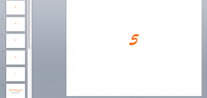
The simple solution to this situation is to create a countdown. This means have 5 or 10 slides counting down to 1 before your title slide.
The benefit of this is threefold. Firstly, you avoid the loss of impact due to prematurely revealing your main slides as described in the situation above. Secondly, it will give you a chance to scroll through a few slides before you start to help ensure that there are no hardware or software glitches. Thirdly, a countdown will likely increase audience curiosity in what your content is going to be.


